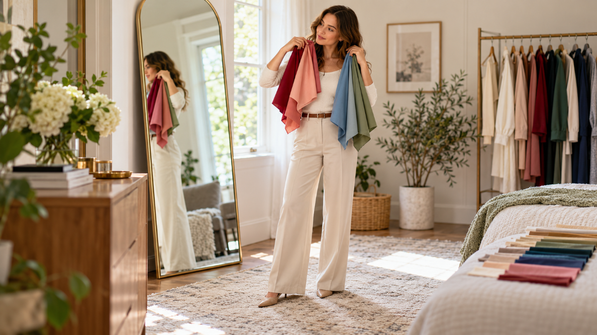
That beautiful top can look right on the hanger and strangely wrong beside your face. The color catches your eye, but your reflection looks tired or washed out.
Online quizzes don’t always help. One calls you an Autumn, another says Winter, and suddenly getting dressed feels harder than it did before.
For women who want a useful wardrobe, color advice should make mornings easier, not turn shopping into homework. You deserve a clear way to test shades instead of guessing from selfies.
Here’s how to find your color season using daylight, a mirror, and clothes you already own. You’ll learn what to look for, how to read the results, and how to build outfits without buying a whole new closet.
Why Finding Your Color Season Can Feel So Confusing
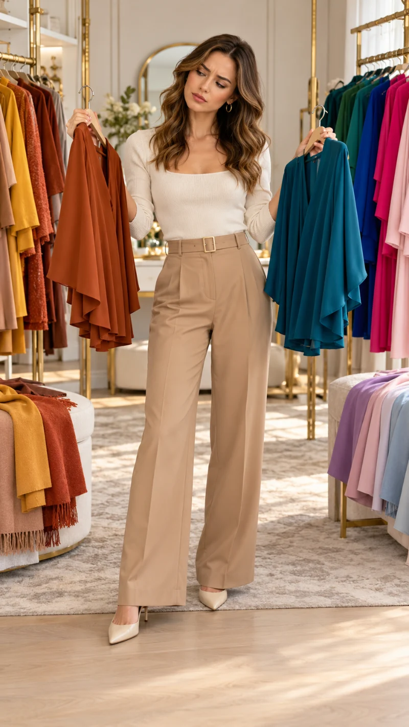
Seasonal color analysis sounds simple until you try to match yourself to a chart. Some guides focus on hair color. Others tell you to study your wrist veins or decide between gold and silver jewelry.
The problem is that none of those details tells the whole story.
Your skin can have a warm, cool, or fairly neutral undertone. Hair dye, makeup, and lighting can also change how your coloring appears. Even two people with similar skin tones may prefer very different clothing colors.
There are four main seasonal families: Spring, Summer, Autumn, and Winter. Many color analysis systems divide these into 12 smaller groups, including Soft Summer, Deep Autumn, and Bright Winter.
Start With the Three Color Clues That Matter Most
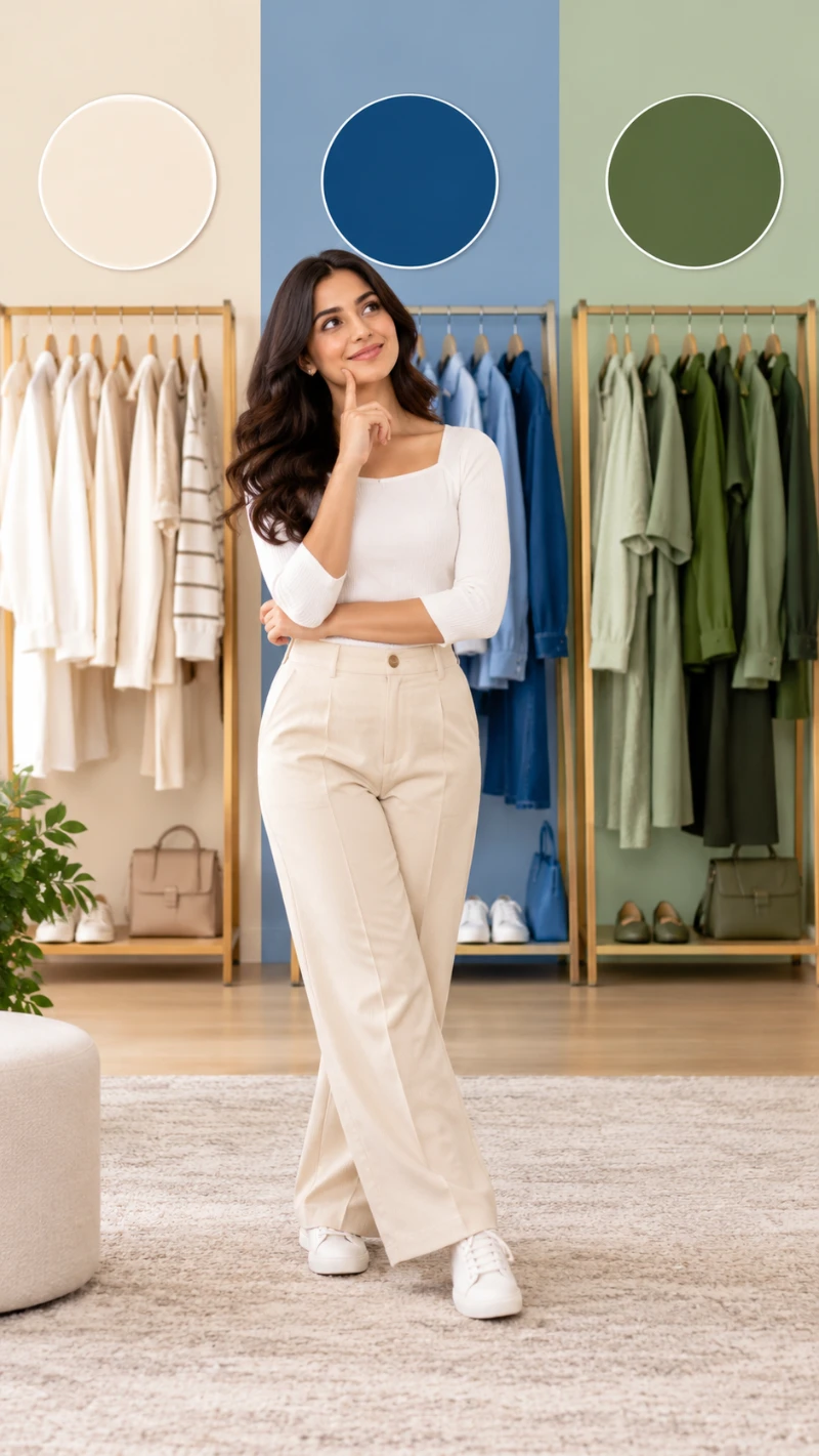
Before looking at seasonal palettes, pay attention to three things: undertone, depth, and color intensity.
Undertone is about how warm or cool colors work with your complexion. Warm colors tend to have yellow, peach, or golden qualities. Cool colors lean more blue, pink, or violet.
Your undertone is not the same as how light or dark your skin is. A deep complexion can be cool, and a fair complexion can be warm.
Depth describes how light or dark a color is. Some people feel more balanced in pale blue and soft cream. Others find that navy, burgundy, or deep green gives their features more definition.
Color intensity, also called chroma, is the difference between bright, clear shades and softer, muted ones.
A vivid cobalt blue feels very different from dusty blue. Both are blue, but one is stronger while the other has a grayer, softer quality.
You can start exploring these differences with a few pieces of fabric.
| What to test | Fabric colors to compare | What to look for |
|---|---|---|
| Warm vs. cool | Coral pink and cool fuchsia | Which makes your complexion appear more even? |
| Light vs. deep | Powder blue and navy | Which gives your face better balance? |
| Bright vs. muted | Clear cobalt and muted blue | Which supports your features without taking over? |
Try to keep the colors similar in other ways when comparing them. For example, two equally bright pinks make a better warm-versus-cool test than a pale pink and a deep red.
The goal is to notice repeated results. One flattering color is helpful, but several colors pointing in the same direction tell you much more.
Set Up a Free Color Analysis Test at Home

You don’t need a special fabric kit or an expensive mirror. A quiet spot near a window and a few pieces from your wardrobe are enough to get started.
Choose a time when soft daylight comes through the window. Avoid direct sunlight because it creates strong shadows and changes how colors appear.
Turn off yellow or colored indoor lights. Keep the background as neutral as possible so nearby colors don’t affect what you see.
A bare face is useful for this test because foundation, bronzer, and lipstick can change the color balance. If you have dyed hair, pull it back or cover it with a neutral towel while comparing fabrics.
Now collect a few solid-colored tops, scarves, or clean fabric pieces.
An ivory blouse, a white T-shirt, a coral sweater, and a cool pink scarf could give you a useful starting set. Add light and dark colors, plus a few bright and dusty shades.
Fabric note: Matte cotton or other non-shiny fabrics are easier to compare than satin, sequins, or glossy silk. Shine reflects extra light onto your face and can make the result harder to read.
Don’t worry if your wardrobe doesn’t contain every color you need. Borrow a scarf or use a clean pillowcase rather than buying a testing kit.
Your phone can help you record the comparisons, but look in the mirror first. Cameras often adjust brightness and white balance automatically, so photographs may not show the colors exactly as you saw them.
Compare Colors Against Your Face, Not Just Your Features
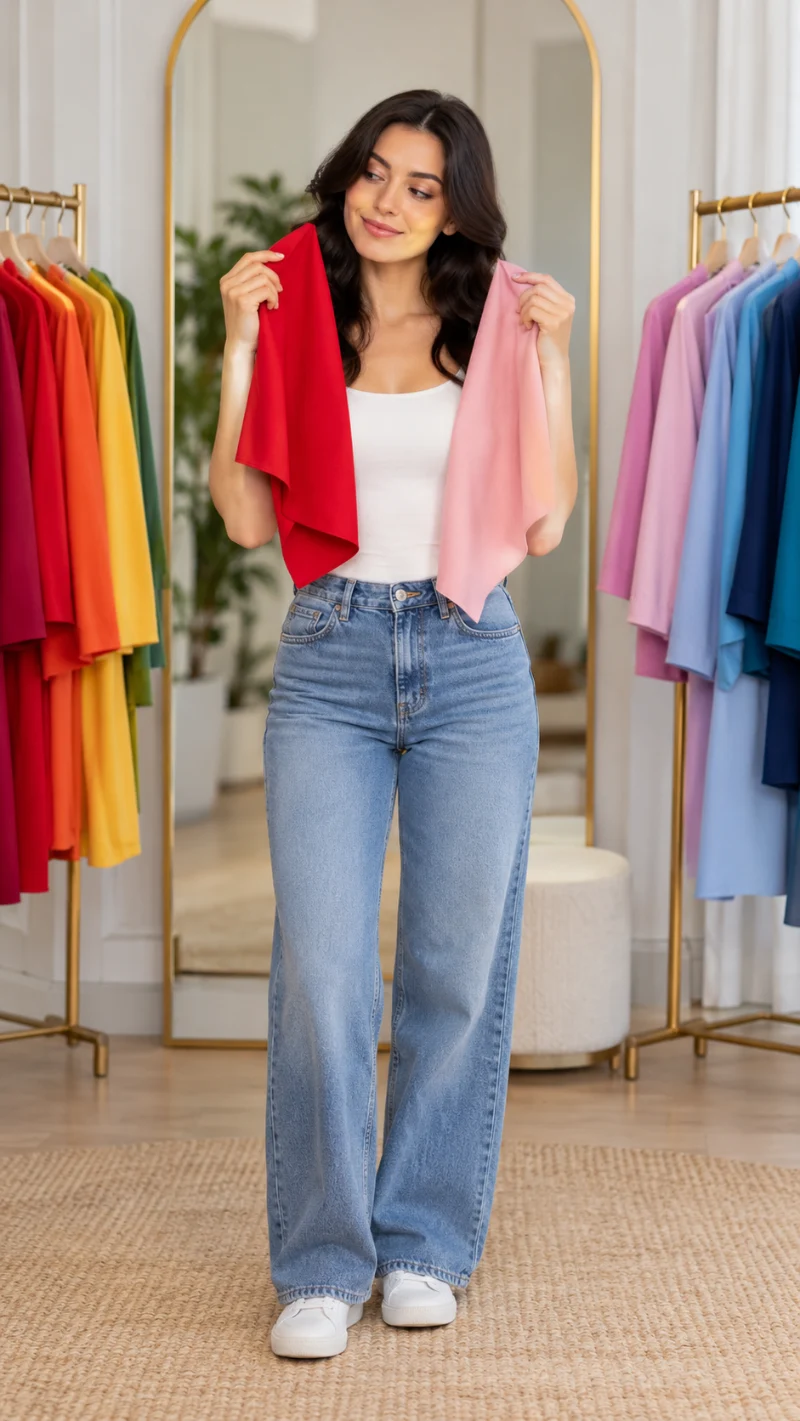
This is where at-home seasonal color analysis becomes useful.
Instead of guessing your season from your eye color or hair shade, hold each fabric directly under your chin.
Pay attention to your face rather than the fabric itself. A color can be beautiful on its own but less balanced beside your natural coloring.
Look for changes in how even your complexion appears, how clearly your eyes stand out, and how much attention the fabric pulls away from your face.
Try this simple comparison method:
- Choose two contrasting shades. Start with coral and fuchsia, or another warm-and-cool pair.
- Hold one color under your chin. Let it cover your upper chest and shoulders without blocking your face.
- Switch to the second color. Compare the effect on your complexion, not which fabric you prefer.
- Repeat the switch a few times. Write down which shade consistently appears more balanced.
A helpful color may make your features seem clearer and your complexion more even.
Another shade might create the appearance of extra shadows or draw attention to the fabric before your face.
These differences can be subtle. Not every comparison will have an obvious winner.
If two colors look equally good, that’s still useful information. It may mean that color temperature is less important for you than depth or brightness.
You can also try the test on another day to see if the same shades continue to work. Consistency matters more than choosing an answer quickly.
Use Your Results to Narrow Down Your Seasonal Palette
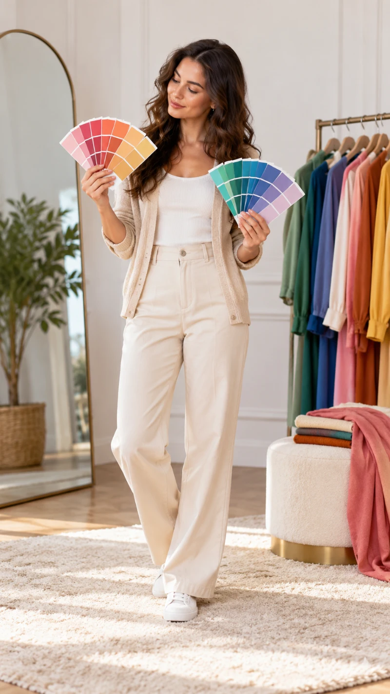
Once you have compared several colors, look for a general pattern.
Most seasonal color systems begin with four families. Spring and Autumn are usually warm, while Summer and Winter are usually cool.
Spring often favors fresh, clear warmth. Autumn leans toward warmer, softer, and earthier colors.
Summer tends to suit cooler, gentler shades. Winter usually includes cooler colors with greater clarity or depth.
These descriptions are starting points, not fixed rules about your skin, hair, or eyes.
The table below shows how to translate each seasonal direction into practical clothing choices.
| Season to explore | Everyday outfit swap | Dressier color swap |
|---|---|---|
| Spring | Try warm ivory or peach instead of dull gray | Try fresh coral instead of dusty mauve |
| Summer | Try soft blue-gray instead of very bright white | Try muted berry instead of neon pink |
| Autumn | Try camel or olive instead of icy beige | Try rich rust instead of bright fuchsia |
| Winter | Try crisp white instead of yellowish cream | Try sapphire blue instead of dusty teal |
Notice which suggestions match the colors that worked during your fabric test.
If coral, peach, and warm ivory consistently look good, Spring could be worth exploring.
If olive, rust, and camel seem more balanced, Autumn might be a better starting point.
On the cooler side, someone who looks good in muted rose and blue-gray may want to explore Summer. Strong contrasts such as crisp white and sapphire might point toward Winter.
What About the 12 Color Seasons?
The 12-season system breaks each main family into three more specific groups.
For example, Summer may be divided into Light Summer, Cool Summer, and Soft Summer. Autumn commonly includes Soft Autumn, Warm Autumn, and Deep Autumn.
These smaller categories help explain why someone may prefer certain colors within a larger family.
You don’t need to work out all 12 possibilities at once.
Start with the main seasonal direction. Then notice whether you prefer lighter, deeper, brighter, or more muted versions of those colors.
If you sit between two palettes, feel free to borrow from both. Your wardrobe doesn’t need a strict label to work well.
Avoid the Shortcuts That Can Give You the Wrong Season

Some popular color-analysis tips sound easy, but they can lead to conflicting results.
A few are worth treating as clues rather than answers.
– Using only the wrist-vein test. Blue or green-looking veins don’t reliably identify your undertone. Lighting and skin characteristics affect how veins appear, so compare clothing colors instead.
– Trusting one online filter. A phone camera may change skin color through automatic processing. Use online color-analysis tools for ideas, then check the suggestions with real fabric in daylight.
– Deciding from hair and eye color alone. People with similar features can suit different color palettes. The result of fabric draping matters more than matching yourself to a chart.
– Testing with heavy makeup or colored lighting. These can change the appearance of your complexion. Repeat the test with more neutral lighting and less makeup if your results seem inconsistent.
You may also notice that a color you dislike is one of your better matches. That’s completely possible.
Personal taste and color harmony are not the same thing.
You don’t have to start wearing a color just because it suits your complexion. The useful part is understanding its qualities so you can find another shade you genuinely enjoy.
Build a Simple Outfit Formula From Your Best Colors
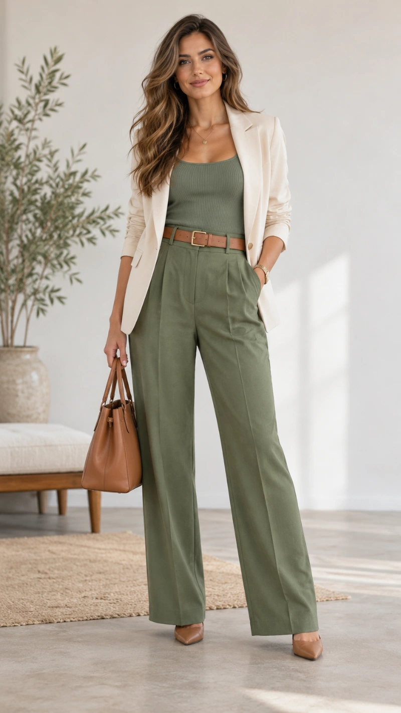
Finding your color season becomes worthwhile when it helps you get dressed.
You don’t need a completely new wardrobe, and you certainly don’t need to throw away clothes that fall outside your suggested palette.
Start by choosing two or three colors that consistently looked good during your test.
One can be a neutral, such as navy, cream, charcoal, or camel. Another can be a color you love wearing. The third can be an accent that works with both.
Formula: A top in your best neutral + straight-leg trousers + a cardigan in a tested accent color.
This works because the colors closest to your face are the ones you’re actively choosing from your test results. The trousers create a simple base without competing with the upper half of the outfit.
For a casual day, you might wear a warm ivory T-shirt, dark jeans, and a coral cardigan.
A cooler, softer version could include a blue-gray knit, charcoal trousers, and a muted berry scarf.
For work, replace the cardigan with a blazer. For an evening out, keep the same color pairing but choose a dressier fabric or a simple piece of jewelry.
Budget-friendly tip: If you own a black blazer but discover that softer colors suit you better, keep wearing it. Add a scarf or blouse in one of your preferred shades near your face.
A useful personal color palette should give you more outfit options, not fewer.
Instead of asking whether every item belongs to your season, focus on building combinations that feel comfortable, balanced, and easy to repeat.
Frequently Asked Questions
Can I find my color season for free online?
Yes. Free seasonal color analysis quizzes and digital palettes can help you explore possible color families.
However, a photo-based result can be affected by lighting, makeup, and camera settings. Use online tools as a starting point and confirm the suggested colors with fabric comparisons in natural light.
How do I know if I have warm or cool undertones?
Compare warm and cool clothing colors directly beneath your face. Warm shades might include peach, coral, and camel, while cool options include fuchsia, raspberry, and blue-gray.
Look for a repeated pattern in how balanced your complexion appears. Avoid relying on wrist veins or jewelry preference alone.
What if I look good in both warm and cool colors?
You may have relatively neutral coloring, or another quality, such as depth or brightness, may matter more for your wardrobe.
Try comparing bright and muted shades next. You may also find useful colors across two neighboring seasonal palettes.
Can I wear black if my color season is Autumn or Summer?
Absolutely. Seasonal color analysis is a styling guide, not a ban on particular colors.
If black feels too strong near your face, try wearing it as trousers, a skirt, or shoes. You can also soften a black jacket with a blouse or scarf in one of your preferred shades.
Does my color season change when I dye my hair?
Hair color can change the overall contrast of your appearance and influence how certain outfits feel.
However, changing your hair color doesn’t automatically change your underlying skin tone. If you’re unsure, compare fabrics with dyed hair pulled away from your face, then consider how the hair color affects your finished outfits.
Conclusion
Learning your color season doesn’t have to involve an expensive consultation or a complicated set of fashion rules. A few honest color comparisons can help you understand why some shades feel more balanced than others. From there, you can build a small palette around clothes you already enjoy wearing.
The goal isn’t to dress according to a label. It’s to feel more confident making your own choices. Try comparing two colors from your wardrobe this week. That small discovery may be all you need to start.